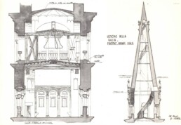
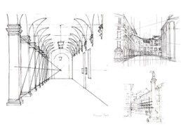
The Architect's Drawing - 2
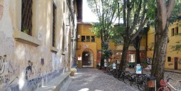
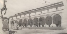
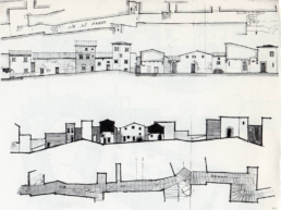
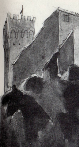
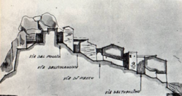
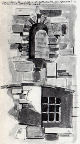
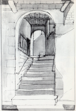
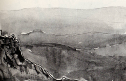
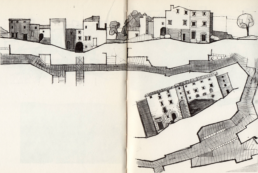
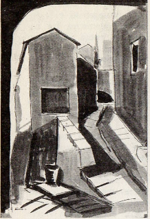
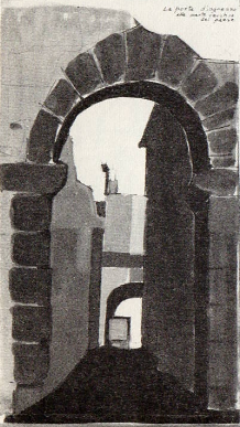
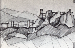
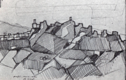
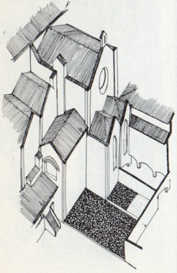
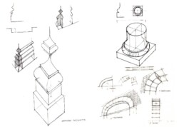
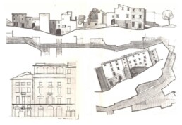
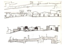
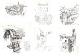
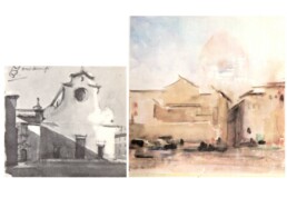
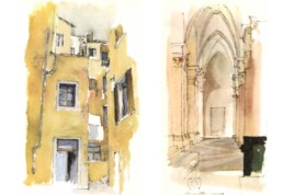
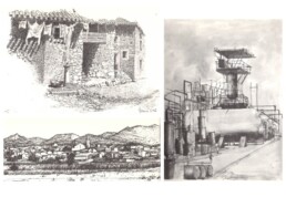
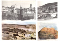
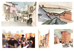
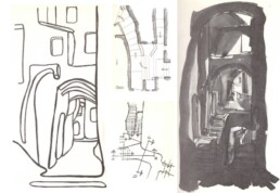
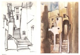
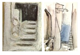
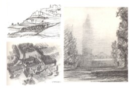
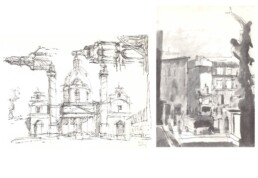
A small old town where you could stay all day and quietly draw. Our professor, Carlo Maggiora, used to organize a three-day trip every year at the end of the course; all you needed was paper, pencils, watercolors, a tent, and a great desire to draw.
Here we see the suggestions of Rocca Tederighi, but there were also Sperlonga, Manarola, Pomposa, Casale Marittimo. Unforgettable experiences.
The Architect's Drawing - 1
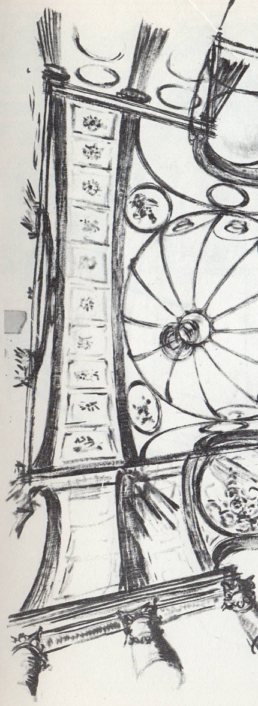
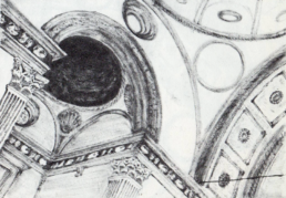
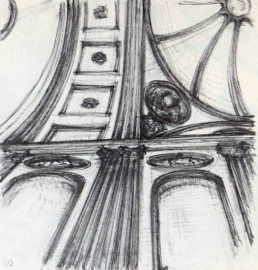
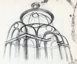
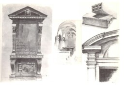
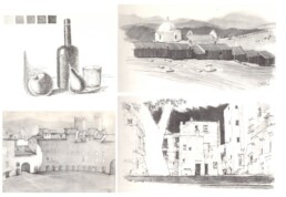
There was a time when in the Faculty of Architecture you had to learn to draw, and draw as an architect, not as a painter. Drawing meant knowing how to manage space, a necessary prerequisite to then be able to create something in three dimensions. Space is geometry, materials, proportions, light, colors.
Today too many students become architects despite being completely illiterate in space and design.
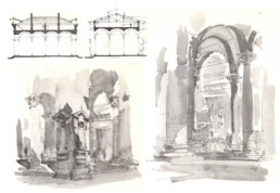
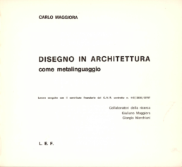
In the Faculty of Architecture in Florence, a remarkable tradition of architectural drawing existed until about the 2000s. I am grateful to a great teacher, Carlo Maggiora, who educated us in drawing.
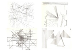
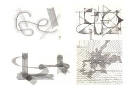
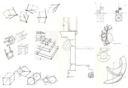
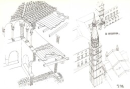
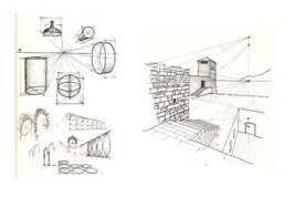
His early lessons were about educating gesture; because the piano is not played with your fists. Here I report some initial exercises. These and the examples that will follow are works of students in the first two years of the course of study, and so we note some typical mistakes and naiveté. But the path they have started is the right one.
A Hobby of John Ruskin
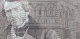
A watercolor by John Ruskin, dated 1872, depicts with absolute accuracy a detail of the southwest facade of the Baptistery of San Giovanni in Florence. Shapes, proportions, perspective, colors, everything is perfect, and even the most minute details are reproduced with extreme fidelity: the connections of the marbles, the chipping of the cornices, the tessellations of the facing slabs.
This perfection intrigued me. I had a photograph of the window, so I enlarged it and compared with the watercolor: perfect coincidence. Therefore Ruskin used a handheld optical camera, “photographed” the image on a sheet of paper, traced its outlines, and then colored it.
Optical cameras were used by painters such as Canaletto, Bellotto, Guardi, and Vermeer himself. Ruskin is thus in good company, but he differs because he was not a professional and created these works out of passion: a passion to represent as faithfully as possible what he loved, not the ambition to demonstrate skill. And then in any case one has to know how to do certain paintings, although he helps himself with tools.
Having done some cursory research, I have found no record of similar verifications done on other works by Ruskin, but perhaps some scholar can elaborate on the topic and give us a better understanding of how he operated. Thanks to his scrupulousness, however, we can now make a point: the watercolor very reliably documents the state of the monument in 1872, when it was fourteen centuries old, while the photograph, taken before the facade cleaning done in 2014, documents the dirt accumulated over a century and a half. Ruskin thus allows us to meditate not only on the degradation of monuments but also on the pollution of the planet.
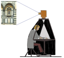
Probably the optical chamber used by Ruskin was of this type: lightweight, detachable, and… curiosity-proof. It’s also likely that a helper kept kids and troublemakers away, and kept watch when Ruskin took a break.
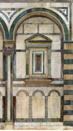
Ruskin 1872
The Baptistery, Florence: Study of the Upper Part of the Right-Hand Compartment on the Southwest Façade
Watercolor and bodycolor over graphite on wove paper – 52 x 34.6 cm.
Ruskin’s work is part of a series of watercolors and drawings made on the occasion of one of his trips to Tuscany in 1872.
Credit: The Victorian Web – Ashmolean Museum, University of Oxford
https://victorianweb.org/index.html
Image used for scholarly or educational purposes.
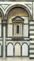
Photo 2013
The photo was taken before the cleaning of the facades in the years 2014-2016. Comparison with Ruskin’s work makes it possible to identify the parts that remained original and those that were replaced, probably in the restorations of 1939-42.
Birth of the Corridor
Birth of the Corridor
It seems that the invention of the corridor can be attributed to the English architect John Thorpe, who in 1597 built a house in London with the first example of this constructive solution that will then be applied in the most diverse contexts.
Unfortunately we have no further information on Thorpe’s work, so to explore the topic we must refer to the construction of Coleshill House, an English noble residence built in Berkshire by architect Robert Pratt in 1650, with similar assumptions. This building no longer exists because of a fire in 1952, but its floor plans show that it had a series of rooms on two opposite sides, divided by a long corridor.
Coleshill House was a house of aristocrats, and at the time (17th-18th century) those houses were organized with rooms placed in succession to create scenographic effects to visually give to guests and visitors the idea of the wealth and power of the owners. The most seeked effect was the so-called enfilade, i.e. a perspective suggestion created by aligning the doors of the rooms. In this way they could brilliantly get the aim of represent their social role, but passing through the rooms was unfitted for privacy. Moreover, the owners, in order to enjoy any possible comfort, had to live daily in a very close relationship with the servants, whose pervasive presence gave rise to delicate situations and continuous discomfort. Even if the aristocrats behaved without minding at the servants, as if they didn’t exist, this coexistence was a source of stress and gossip, and not infrequently also of murky stories and violence.
To mitigate these problems the rooms were organized in a progressively greater private use ratio, beginning from halls and drawing rooms closer to the entrances to the more distant and private bedrooms, which were gradually equipped with changing and sitting rooms and boudoirs, thus becoming secluded areas – hence the term ‘apartment’ – reserved for the owners and for those who were allowed to share their intimacy: relatives, friends, lovers. And, of course, the servants who had to be always available when called and disappear when their presence was no more needed. For this reason, paths were created reserved for them and separated from the main ones, with narrow stairways and passages from which at any time, at a bell ring, the servants could reach the masters’ rooms from the kitchens and other rooms of theirs, usually placed in basements or attics.
Naturally these passages were also used for other purposes, more or less lawful and secret, but very busy, as we find in a lot of novels (as Dumas’ ‘Queen Margot’) and movies.
Today we think at a corridor as a narrow and long room used as a passage to give access to a series of rooms in which functions are performed. Now, the corridor of the Coleshill House is a little different, because it performs also as a filter towards pairs of small modular apartments and has inside the stairs of the servants. In short, the functional organization is evolved, but the criteria of the aristocratic residences are still applied, and it could not be otherwise because of the existing social rules to be still observed. However, a line was traced to be followed, even if for a very long path: the separation of servants is in fact still found in the early twentieth century in many bourgeois villas, which have small doors on the edge of the main facades and reserved for the servants who used them without passing in the representative rooms.
So, Coleshill was a first step towards the corridor as we think of it today, but Pratt seems also to have given way to a precise building typology, technically called ‘triple bodied’, which had to get an enormous diffusion due to its affordability in order of functional, constructive and hygienic performances, so that was applied in the early twentieth century for large social housing projects. After the following customs evolution not behaviors were distinguished but functions, and rooms got some freedom in use inside, as long as their access was controlled. As many parents know when their children’s bedrooms have become strictly off-limits.
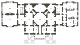
An aristocratic residence with reception rooms and private areas but no corridors: the Chiswick House in London, by Richard Boyle (1726).
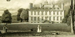
View of Coleshill House in an 1818 engraving by J.P. Neale and H. Hobson (British Museum).

Coleshill House floor plans. In the basement (left) are placed kitchens, cloakrooms, pantries and other rooms for the servants’ works; on the ground floor (center) the atrium with the main staircase, two apartments, a hall, a living room, a nursery; on the first floor (right) a large dining room and four apartments. Is missing the plan of the attics with the servants’ bedrooms. Note that the corridor is flanked by large walls where chimneys are placed; they also keep the apartments warm and support the roof terrace.
Caesar's Beard
Roman portraiture is one of the peaks of classical art. When looking at the bust or statue of an ancient Roman we feel a strong emotion, because those portraits intensely communicate the personality of the subject, as bringing him to life in front of us again. Art historians explain the techniques, the schools, the Etruscan and Greek influences; but there is an aspect of those faces which brings me, as an architect, along paths that are not those of aesthetics and history of art.
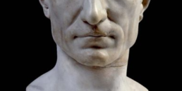
Let’s look, for example, at a Caesar’s portrait: the face appears so perfectly shaved, that not even Mr. Gillette would have objected to; and like Caesar a lot of emperors, viri illustres, important characters or unknown ones.
elf but had his own barber, an expert servant who provided for what necessary: shaving at home meant not only sharp razors and soothing balms, but also hot water for compresses and ablutions, and we can guess that some slaves were ready every day at fixed times to boil water in a pot after having drawn it from some fountain connected to one of the numerous aqueducts that served the city. Alternatively, one could go to the thermal baths, and it is probable that Caesar frequented the best ones; anyway even there everything worked thanks to the aqueducts.
Therefore, Caesar’s shaving, like that of a lot of other Roman faces portrayed in marble, depended on the existence of aqueducts, whose construction presupposed a complex organization and a technical knowledge that no other people of the ancient world possessed; and Romans could be proud of that. In short, those clean-shaven faces expressed a subliminal message of superiority, as: «I’m shaved, and I can shave because we have aqueducts; and if you don’t shave it’s because you don’t have them; and you don’t have them because you don’t know how to build them. You are far behind us.»
So, Caesars’ perfect shave expressed a message of supremacy all the more effective as it was translated into terms of daily habits, of unattainable comforts for the many who lived in remote villages in the forests, and who were not by chance called ‘barbarians’.
And those Roman characters portrayed with a beard?
Perhaps it was due to a habit or a fashion, perhaps was a reference to the origins in distant provinces, or to the military campaigns, because on those occasions it must have been necessary to let the beard grow, for Caesar too. But he didn’t let himself portraited with a beard.
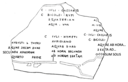
Fragment of an engraving depicting the plan of an aqueduct with the names of the users, the amount of water they were authorized to draw and the hours of withdrawal (From Mommsen, C.I.L., IV, I).
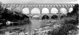
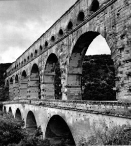
View of the Pont du Gard near Nîmes. Note that in the third order the water conduit (specus) was not made to rest on a structure with large arches like the one below, but on small arches, both for the purpose of obtaining more precise control of the slope during the execution of the specus, both to minimize the inevitable settlements of the structure causing water leaks and to improve the maintenance works.
Michelangelo Under the Trapdoor
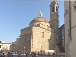
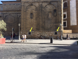
Zoom in: Florence – Church of San Lorenzo – Medici Chapels.
Action: a visit with Postgraduate School students to the restoration of Michelangelo’s New Sacristy carried out by the Soprintendenza ai Monumenti. Emotion, respectful silence.
On our way out, however, we cross a turbulent class of kids on school trip who break the magical atmosphere with a pizzeria behavior. No one is there to keep them in check; I can’t resist and make a few reprimands, but to no avail. One of them even protests: “We paid a ticket!”
Then fortunately they leave. I am approached by a janitor who has seen me rather altered. “Don’t be angry, come along, I’ll show you something and you’ll calm down.”
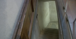
We enter a small room to the left of the altar. In the floor, still on the left, is a long, narrow wooden trapdoor. He opens it, and that remains poised, as suspended, by the effect of an invisible counterweight. Ingenious, I think.
– Thank you, is that what you wanted me to see?
– Nooo. Come, come down with me.
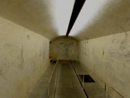
A few steps and I am in a low, elongated cellar, all empty. On the white walls a few stains and strange cobwebs. Then I realize: no stains, no cobwebs! These are mind-bogglingly beautiful drawings; it is Michelangelo’s ‘Secret Room’!
In the summer of 1530, after the fall of the Florentine republic of which he had been a supporter, Michelangelo stayed a few months in hiding here to escape the revenge of the Medici, and to pass the time he drew his ideas on these walls, reflecting among himself or with a friend, who also left us some ugly doodles.
However, I want to make a modest reflection as well, and it concerns the curious trapdoor with the counterweight. Monica Bietti dated it to the 1500s, thus contemporary with the construction of the Sacristy, and indeed the housing of the concealed mechanism in the wall indicates a contextual realization. But why was such a sophisticated solution chosen for a simple trapdoor?
Let’s reason a little.
Premise: the trapdoor was necessary. If access to the staircase had been left open in the small room, the gap in the floor would have required the protection of a cumbersome railing, so here is the convenience of the trapdoor, which originally, when someone had to go down into the cellar to draw water from a well that is still there, one can imagine was held open with a hook or prop, as one always does.
However, when Michelangelo had to hide in that very cellar, a new problem arose, because he had to be able to get out of there at any time with the trapdoor closed. Hence the utility of creating a mechanism to open it effortlessly from the inside; and it also had to be a mechanism that would not reveal its presence, even though it was likely kept hidden under a carpet or mat. With this ingenious contraption, therefore, all that was needed was a gentle push from underneath, and the trapdoor, balanced and light even if rather heavy (15-18 lb), could be opened without difficulty, without having to call anyone, without maneuvers made complicated by haste or perhaps by darkness due to the sudden extinguishing of a candle. And especially without the danger of it falling on Michelangelo’s precious head or those of his visitors.
So, let’s close the trapdoor again.
Hi Michelangelo!

Design with Kindness
Think how depressing it is to spend our time together with sad people, who stand there with a long face without saying a word. Of course anyone would prefer to be with cheerful, nice, interesting people, no matter if they are beautiful or ugly, because it is not an aesthetic issue. Some actors were successful even though they were not top beauties; however, they were nice.
The same can be said about buildings around us in our daily lives. Look out the window: maybe you see beautiful facades and picturesque landscapes, but even if the aesthetic look would not be satisfactory you would still be happy if you see spaces pulsating with life. A friend of mine, forced to work locked inside an isolated, silent office, often telephoned home for someone to go with the phone to the window so he could listen to the shouts of kids playing ball in the courtyard.
In short, to a beautiful but unwelcoming environment one may prefer another that is not beautiful but cozy.
Many environments are not only ugly, but hopelessly sad and depressing too, and when a new building is to be made, all designers strive to improve its aesthetics and demonstrate how able they are. All that is fine, but wouldn’t it also be desirable to try to make something welcoming, nice, positive? Because in addition to taking care of forms, a designer can also try to include in his works some chance for politeness, that is, to create something to solve, alleviate or avoid the situations in which users might fall for some difficulty or potential discomfort, even if they wouldn’t fully realize that he was aware about.
Courtesy can be expressed in an infinity of design occasions with an infinity of inventions, ways and ideas. A few examples: invitation, shelter, orientation. Invitation: suggesting ‘welcome’ in a lobby, or at the beginning of a lane or of a staircase by shaping steps, doors, handrails, ceilings, or accompanying the path with sinuous, soft and continuous forms, shaded surfaces, precise lights. Shelter: canopies and porches under which to linger away from rain or sun, or storing an umbrella or looking for key are forms of courtesy that let you feel you’re welcomed, while it is sad to see doors that propose only an in or out. Orientation: complaints are frequent from people who cannot find their way in a public building, a hospital, a courthouse, an office complex. That can mean a project failure, with huge waste of time. Often these design cues arise at the beginning of a path, where communication design themes are proposed. Today you see in environments frequented by the public a plethora of signs to orient people. Many are necessary, but if too many they disorient, or if badly placed they serve little purpose because people, being often in a hurry, do not read them preferring to ask, or follow others, or try to guess. Wayfinding concepts should be applied, but not only as signage, because the more signs are needed the less communicative architecture is.
More generally, we can find kindness design occasions by thinking about the perceptual or behavioral sequences in which people may find themselves. For example, we can identify a succession of user actions to match with the design of a succession of spaces and functions, and we study whether in this succession some hitches may occur due to situations in which the user may find himself in difficulty. It is there that the designer can fit in with the design by creating something with skill and imagination.
It would be nice if some university courses taught applied courtesy, that is, how to plan what can put people at ease.
Other opportunities are offered by thinking about how to avoid situations of conflict (typical case, disputes in apartment buildings, due to poorly done designs) or the occasions of nuisance or embarrassment, often caused by the wrong placement of noisy devices or toilets.
By applying some kindness concept in our designs we could achieve amazing results. And if a designer is good, he will be concerned not only with solving the problems of a normal use, but of marginal cases too, such as children, elderly, foreigners, or those who are in a kind of behavioral trap because missing a train, or need a bathroom, or cannot see a transparent door, or lost in the crowd. An infinity of design opportunities.
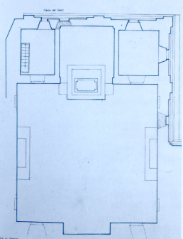
A remarkable application of these concepts was given by Charles Garnier in the design of his Paris Opéra, a true masterpiece in matter of user assistance. He studied down to the smallest detail everything he could do to provide his users with the positive experience of a pleasant evening at the theater: that is, to create meetings opportunities in the foyer, to avoid cab lines on the way out, to take shelter from the rain while waiting for a rendezvous, to make it easier for those arriving late, and even to get a good reverb to make faces take on a warm color if pale, or eat ice cream without the annoyance of smokers, or make the emperor admire up close the ballerinas.
To all this Garnier responded not with signs and signals, but with architecture. Apart from aesthetics, so far from today’s preferences, it was a great lesson.

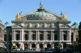
Garnier designed the Opéra thinking of everything he could do to make the public have a nice evening at the theater.
The Bar Counter Length Question
All professors have a secret repertoire of exam questions that could be drawn on when they want to get a student in trouble, and maybe knock him off.
One of these questions was suggested to me by a friend professor who had been a very good athlete and an expert in sports facilities, but it was a little staggering:
– How long should the bar counter in a stadium be?
Thinking about it with a cool head, the question wasn’t too difficult, but in the tension of the exam it could result deadly.
To get the answer, first one had to put some references, hypothesizing a typical situation. Normally each stadium sector has its own bar, and if we imagine that in a sector of 3000 seats 25% of people take coffee during the interval of a game, the bar should provide 750 coffees in 15 minutes, that is 50 coffees per minute.
The average time of a coffee drink, which can vary depending on the type of service, environmental factors etc., can be estimate in 45 seconds. 15 minutes are 900 seconds, and divided by 45 is 20, i.e. every 45 seconds 20 people will come to the counter; therefore, given to each person a space of 2 ft, the length of the counter will be 2 ft x 20 = about 120 ft. This could be an average result: depending on how the staff is organized and on their capacity, it’s possible a little wider or a little narrower measure, even admitting some queues.
Generally, the students attending the exams carefully listened those little tests of skills to get dimensions not subdued to particular rules, solved with empirical and largely probabilistic evaluations which had to be adapted to the case, but could be used in similar situations.
If we come to think about it, in fact, that reasoning was the same that a lord of a castle had to do to evaluate if he could defend his crenellated walls, or the sanitary officer who had to size the burial fields of the municipal cemetery, or the restaurant manager for the tables to be served and so on.
So, seeing a queue at an highway tollbooth, a ticket office or at a vaccination post, often I wonder if the persons who designed those places took a Distributive Characters exam, and what grade they got.


Designing with Music
When an architectural planning student has to spend a few hours hunched over a drafting table, or sitting in front of a monitor to manage his CAD proceedings, you can bet that sooner or later he’ll put on his earphones to listen some music; and we can guess its kind: rock, funky, metal, rap and so on. All normal.
But that kind of music, with simple and repetitive sound structures, seemed to me a missed didactic opportunity, because elementary rhythms, times and sequences could lead those students to create spaces also simple, repetitive and elementary. It would have been useful for them to know and memorize other rhythms and other sequences; other musics, in short, from which they could perhaps draw an inspiration, in the unfathomable processes of creative imagination, to suggest new stimulating spaces on a building and urban level. Topics that I can only shortly mention here, but that have very concrete implications: today, to give a case in point, stimulating perceptions are intentionally applied in the design of shopping malls to suggest and direct people to purchase goods.
I certainly couldn’t put such large topics into my students’ works, but I wanted to try a little experiment anyway. So I brought into the classroom a player and some CDs of music – all strictly classical -, I said the theme of the design to be done, closed firmly the door to suggest ‘no escape’ and pressed the play button.
Thus, during my hours of teaching, some melodious soundtracks and even some warbling spread through the corridors – of course at low volume. My students had Ravel, Sciostakovic, Rossini, Tchaikovsky as assistants.
The janitors looked at me a little puzzled and a little amused, while the boys put up with everything politely, and some even asked about what they had heard. Of course, I didn’t torture them too much: I had chosen songs that were well-known thanks to movies and TV, and were also catchy. However the experiment could go, for me it was like sowing in a ploughed field hoping that something would germinate.
But what?
My experiment started from afar. I used to insert some musical reference in what I told in class despite my total ignorance of musical theories; but if I took these didactic risks it was because I wanted to pass on the message of the existence of an affinity between the composition of architecture and that of music. Architectural spaces and musical spaces propose the creation of perceptive structures that both develop over time, and therefore can have rhythms, sequences, counterpoints, themes, variations. For this reason I thought that in order to teach space design it would be useful to have alongside a Conservatory colleague, in order to provide students with the basics of what is common to the two sides, architectural and musical, leading them to listen critically to selected pieces and then to analyze spaces and projects together.
I left teaching a few years ago, but, as far as I know, it seems to me that in the design subjects we still follow completely different paths, repetitive and flat.

Draw the Path you Took to Get Here
“Draw the path you took to get here.”
This is what the course assistants told us, naive first-year freshmen; and we, totally disoriented, realized then that we had sleepwalked through various environments to get into the faculty and reach that crowded lecture hall where our flock and its shepherds were now. And so on we went, all of us thinking about those rooms, how many there were, how big they were, what shape they were in and where they were; but, judging by what we saw on the sheets, with very little result.
This test served to accustom us immediately to looking at the spaces where we moved and lived with new eyes, eyes that measured depths, heights and distances, and that transmitted messages of times and positions to the brain. Eyes of a future architect.
Mindful of that experience, I thought about something like that in my course, in which I treated buildings for entertainment and leisure. At the oral exam I posed a question about one of the theaters previously listed, and for it I asked not a reply in words but a graphic one. For example, “draw from memory the plan of Coliseum”, or La Scala, or Farnese Theater and so on; and if, as was normal, the student couldn’t remember all the rooms, it was enough to draw the shapes of the main areas and place them in the right place.
I knew I couldn’t expect great results from the test, but my purpose was to observe how the students were able to express graphically what they had memorized, and to give them the opportunity to become aware of the capacity they had achieved on this fundamental point of an architect’s training.
The result of all this was to make evident a very large and general problem, because no one student, and I mean no one, began his drawing by preliminarily tracing any construction of the figure, that is to say to pose some references for proportions, axes of symmetry and so on, on which he could model the shape to draw: for example, two cross-shaped axes on which create the oval of the Coliseum. Everyone drew as an amateur painter would have done sitting in the country with his easel painting cows grazing. No one – and they were third year students – had been taught to see the space of architecture as a structure of geometries.
In my judgment I was always wide, very wide, also because eventually I should not fail them, but the faculty: the faculty of today, of course, because the faculty of my time immediately laid certain foundations, and without them none could go forward.
